Create a Modal with React, Typescript and portals!

First let’s start our project. Or just go to the repo
$ create-react-app my-modal --template typescriptthe versions of node and npm that I have.


Once install and stuff the first thing is to open the index.html that is inside the public folder! Open it and add a div tag under <div id="root"></div>

I maned it “root-modal”.
Time to create the HOC (high order component) I created a folder named ./src/hoc in there a created a file named modal.tsx

This is how modal.tsx looks like:
import * as React from 'react';
import * as ReactDOM from "react-dom";

export type ModalProps = {
    children: React.ReactChildren;
};
export type ModalState = any;

export class Modal extends React.Component<ModalProps, ModalState> {

    private container: HTMLDivElement;
    private modalRoot: HTMLElement;

    public constructor (props: ModalProps) {
        super(props);

        this.modalRoot = document.getElementById("root-modal") || document.createElement("div");
        this.modalRoot.className = "root-modal";
        this.container = document.createElement("div");
    }

    public componentDidMount (): void {
        this.modalRoot.appendChild(this.container);
    }


    public componentWillUnmount (): void {
        this.modalRoot.removeChild(this.container);
    }

    public render (): React.ReactElement<ModalProps> {
        return ReactDOM.createPortal(this.props.children,     this.container)
    }
}
Remember the App.tsx that comes with CRA, clean it up and paste this:
import * as React from 'react';

export interface AppState {
  show: boolean;
}
export class App extends React.Component<any, AppState> {

  public state: AppState;
  public constructor (props: any) {
    super (props);

    this.state = {
      show: false
    }

    this.onClickHandler = this.onClickHandler.bind(this);
  }

  public onClickHandler (evt: React.MouseEvent) {
    evt.preventDefault();

    this.setState(prev => ({
      show: !prev.show
    }));
  }

  public render () {
    return (
      <button className=""onClick={this.onClickHandler} type="button">open modal</button>
    )
  }
}
If you done so, remember to also change the ./src/index.tsx
If you run the app you’ll see some like
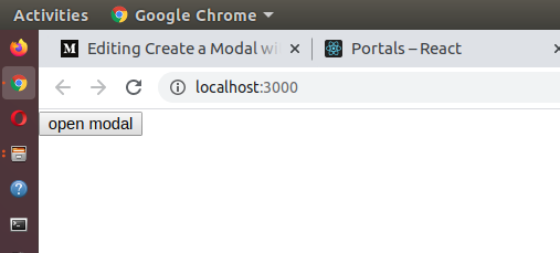
ugly I know, open App.css and paste this
body {
  width: 100vw;
  height: 100vh;
  padding: 0;
  margin: 0;
  background-color: #eee;
}


.btn {
  position: fixed;
  top:50%;
  left: 45%;
  background-color: transparent;
  padding: 1rem 2rem;
  border: 0;
  outline: none;
  cursor: pointer;
  transition: .5s;
}

.btn:hover {
  border: solid 1px teal;
  border-radius: 50px;
  background-color: white;
  color: teal;
  box-shadow: 0 8px 16px 0 rgba(0, 0, 0, 0.2), 0 12px 40px 0 rgba(0, 0, 0, 0.19);
}

.btn:active {
  box-shadow: 0 2px 4px 0 rgba(0, 0, 0, 0.2), 0 3px 10px 0 rgba(0, 0, 0, 0.19);
}

.modal {
  display: none;
  position: fixed;
  z-index: 1;
  left: 0;
  top: 0;
  width: 100%;
  height: 100%;
  overflow: auto;
  background-color: rgb(0, 0, 0);
  background-color: rgba(0, 0, 0, 0.4);
}

.display {
  display: block;
}

.modal-content {
  position: relative;
  background-color: #fefefe;
  margin: auto;
  padding: 0;
  border: 1px solid #888;
  width: 50rem;
  box-shadow: 0 4px 8px 0 rgba(0,0,0,0.2),0 6px 20px 0 rgba(0,0,0,0.19);
  animation-name: animatetop;
  animation-duration: 0.5s
}

@keyframes animatetop {
  from {opacity: 0; scale: 0.5; top: 30rem;}
  to {opacity: 1; scale: 1; top: 0;}
}

.btn-close {
  color: #888;
  float: right;
  font-size: 2.8rem;
  font-weight: bold;
}

.btn-close:hover, .btn-close:focus {
  color: black;
  text-decoration: none;
  cursor: pointer;
}


.modal-header {
  padding: 2px 16px;
  background-color: teal;
  color: white;
}

.modal-body {padding: 2px 16px;}

.modal-footer {
  padding: 2px 16px;
  background-color: teal;
  color: white;
}

*,*::after,*::before {
  box-sizing: inherit;
}
last change App.tsx
import * as React from 'react';
import "./App.css";
import {Modal} from "./hoc/modal";
export interface AppState {
show: boolean;
}
export class App extends React.Component<any, AppState> {
public state: AppState;
public constructor (props: any) {
super (props);
this.state = {
show: false
}
this.onClickHandler = this.onClickHandler.bind(this);
}
public onClickHandler (evt: React.MouseEvent) {
evt.preventDefault();
this.setState(prev => ({
show: !prev.show
}));
}
public render () {
const {show} = this.state;
const styles = show ? "modal display" : "modal";
return (
<>
<button className="btn" onClick={this.onClickHandler} type="button">open modal</button>
<Modal>
<div id="lil-modal" className={styles}>
<div className="modal-content">
<div className="modal-header"><span role="button" onClick={this.onClickHandler} className="btn-close">×</span>
<h2>Modal Header</h2>
</div>
<div className="modal-body">
<p>Lorem, ipsum dolor sit amet consectetur adipisicing elit. Ipsum, dolore.</p>
<p>Lorem ipsum dolor sit amet.</p>
</div>
<div className="modal-footer">
<h3>Modal Footer</h3>
</div>
</div>
</div>
</Modal>
</>
)
}
}we end up with
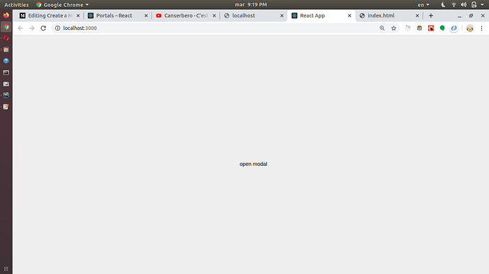
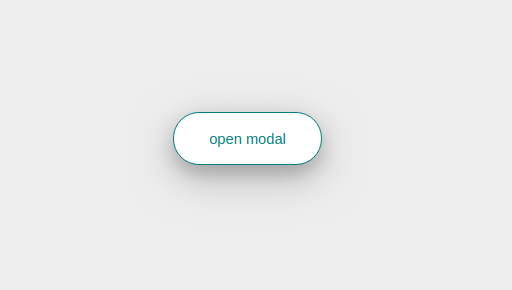
if you hover over the button
and if you click on it. Guess WHAT!!!!!!
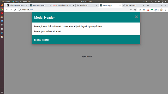
that’s how you create a modal using portals and typescript, I guess.